
Linear regression: a worked dose–response example
Regression answers a different question from group comparisons: not “do these groups differ?” but “how does the outcome change as a continuous input changes?” The fitted slope is the scientific quantity itself — response per unit dose.
The data
A dose–response run, one measurement per dose:
| Dose (mg/L) | Response |
|---|---|
| 0 | 2.1 |
| 5 | 9.8 |
| 10 | 18.7 |
| 20 | 39.5 |
| 40 | 81.2 |
| 80 | 158.9 |
Two-column x–y layout, one row per observation — as in MinutePlot’s regression grid.
The fit
Least squares gives slope = 1.98 ± 0.02 per mg/L (t = 94.5, p < 0.001) with an intercept of 0.43 that does not differ from zero (p = 0.62) — sensible, since zero dose should give a near-zero response. The line explains essentially all the variation (R² = 0.9996): each mg/L of dose adds almost exactly two units of response across the tested range.
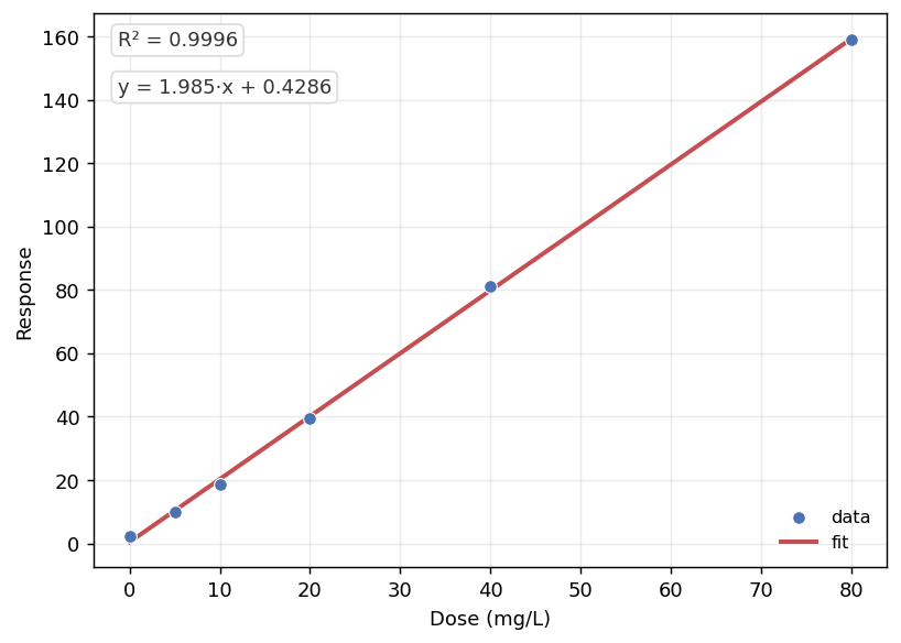
MinutePlot’s regression panel: data, fitted line, equation and R² — ready for the figure legend.
Styling and exporting this figure: see Figure styling and Exporting & downloading.
Report it like this
“Response increased linearly with dose (slope = 1.98 ± 0.02 units per mg/L, t = 94.5, p < 0.001, R² = 0.9996).”
When a straight line is the wrong model
Always look at the residuals: curvature means a polynomial or dose–response model fits better; both are one click away in the same panel. And R² near 1 with visibly curved data is a warning, not a success — the number summarises fit, the plot tells the truth. Extrapolating beyond the tested dose range is the other classic error: the line is evidence only where there is data.
- Montgomery, D. C. (2017). Design and Analysis of Experiments (9th ed.). John Wiley & Sons.