
PCA vs PLS: which one does your question need?
Both methods compress many correlated variables into a few components — but they point in different directions. PCA (Pearson, 1901) is unsupervised: it finds the directions of greatest variation in the measurements themselves, with no outcome in mind — use it to explore structure, spot clusters and outliers, and see which variables move together. PLS regression (Wold et al., 2001) is supervised: it finds components that best predict a chosen response — use it when the question is “which of my many measured variables drive yield / quality / activity?”
The rule of thumb
No response variable, or a question about the samples → PCA. A response you want explained or predicted, especially with correlated predictors → PLS. In practice many analyses use both: PCA first to see the landscape, PLS second to model the outcome.
PCA on the batches: seeing the structure
Running PCA on the same ten batches compresses the four measurements into components: PC1 alone carries roughly 80% of all variation, PC2 another 20% — the scree plot shows the drop, and two components tell essentially the whole story.
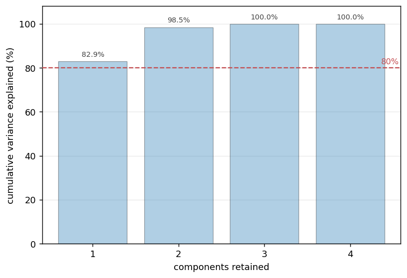
The scree plot: how much variation each component explains. Look for the elbow.
The biplot then draws samples and variables in the same picture: batches spread along PC1, and the variable arrows show why — protein and yield point together (they rise together), moisture points the opposite way. Clusters, gradients, and outliers show up here before any model is fitted.
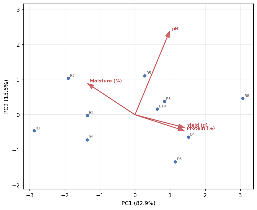
The biplot: samples as points, variables as arrows; arrows pointing the same way are positively correlated.
A worked PLS example
Ten batches with three measured properties and a yield to explain (protein %, moisture %, pH → yield). A two-component PLS model fits and cross-validates well: R² = 0.96 (variance explained) and Q² = 0.94 (predictive power under cross-validation) — and the closeness of the two numbers is itself the health check: a large gap between R² and Q² signals overfitting.
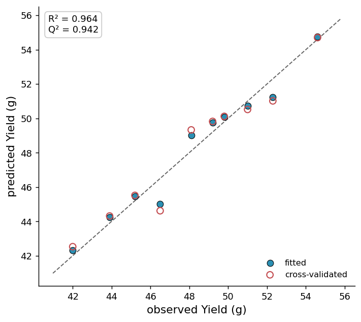
Observed vs predicted: the closer the points sit to the diagonal, the better the model — open symbols show cross-validated predictions.
Reading VIP scores
Variable importance in projection (VIP) ranks the predictors: protein 1.15, moisture 1.09, pH 0.70. The convention is that VIP > 1 marks an influential variable — here protein and moisture carry the model, pH contributes little. MinutePlot’s VIP figure colours each bar by the direction of its effect (raises or lowers the response), so the ranking and the direction read at a glance.
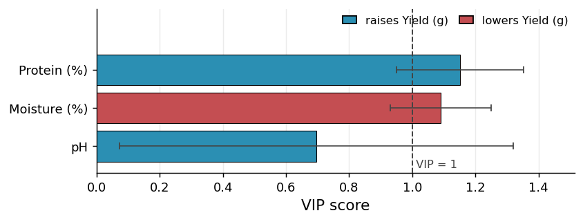
The VIP figure: predictors ranked by influence, the VIP = 1 guide line marked, colours showing whether each variable raises or lowers the response.
Styling and exporting this figure: see Figure styling and Exporting & downloading.
Report it like this
“A two-component PLS model explained yield well (R² = 0.96, Q² = 0.94). Protein and moisture were the influential predictors (VIP > 1), with protein raising and moisture lowering yield.”
- Pearson, K. (1901). On lines and planes of closest fit to systems of points in space. The London, Edinburgh, and Dublin Philosophical Magazine and Journal of Science, 2(11), 559–572. https://doi.org/10.1080/14786440109462720
- Wold, S., Sjöström, M., & Eriksson, L. (2001). PLS-regression: a basic tool of chemometrics. Chemometrics and Intelligent Laboratory Systems, 58, 109–130. https://doi.org/10.1016/S0169-7439(01)00155-1