
One-way ANOVA with post-hoc letters: a worked example
One-way ANOVA compares the means of three or more independent groups in a single test. The F-test tells you whether any groups differ; the post-hoc comparisons and their compact letters tell you which — which is what your figure ultimately needs to say.
The data
Grain yield (g per pot) under four fertiliser regimes, six pots each:
| Values | ||||||
|---|---|---|---|---|---|---|
| r1 | r2 | r3 | r4 | r5 | r6 | |
| Control | 41.2 | 39.8 | 43.1 | 40.5 | 42.0 | 38.9 |
| Low N | 45.6 | 47.2 | 44.9 | 46.8 | 45.1 | 46.3 |
| High N | 50.3 | 52.1 | 49.7 | 51.4 | 50.8 | 48.9 |
| N + P | 51.0 | 49.5 | 52.6 | 50.2 | 51.7 | 53.0 |
r = replicate: r1 is replicate 1, r2 replicate 2, and so on.
This is MinutePlot’s one-way layout: one row per group, replicates across the columns — paste it in exactly like this.
The test
ANOVA partitions the total variation into between-group and within-group parts; a large ratio of the two (the F statistic) means the group means differ more than chance allows. Here: F(3, 20) = 86.9, p < 0.001 — fertiliser affects yield. Assumptions (normal residuals by Shapiro–Wilk, similar group variances) hold for these data; MinutePlot reports the checks alongside every analysis.
Which groups differ? Tukey’s HSD and the letters
An overall p-value never answers the real question. Tukey’s honestly significant difference test compares every pair while keeping the overall false-positive rate at 5%, and the results compress into compact letter display: groups sharing a letter are not significantly different.
| Group | Mean ± SD (g) | Letter |
|---|---|---|
| N + P | 51.33 ± 1.36 | a |
| High N | 50.53 ± 1.16 | a |
| Low N | 45.98 ± 0.93 | b |
| Control | 40.92 ± 1.52 | c |
Read it directly: both high-nitrogen regimes beat low N, which beats the control; adding phosphorus on top of high N gave no further detectable gain (the two share the letter a).
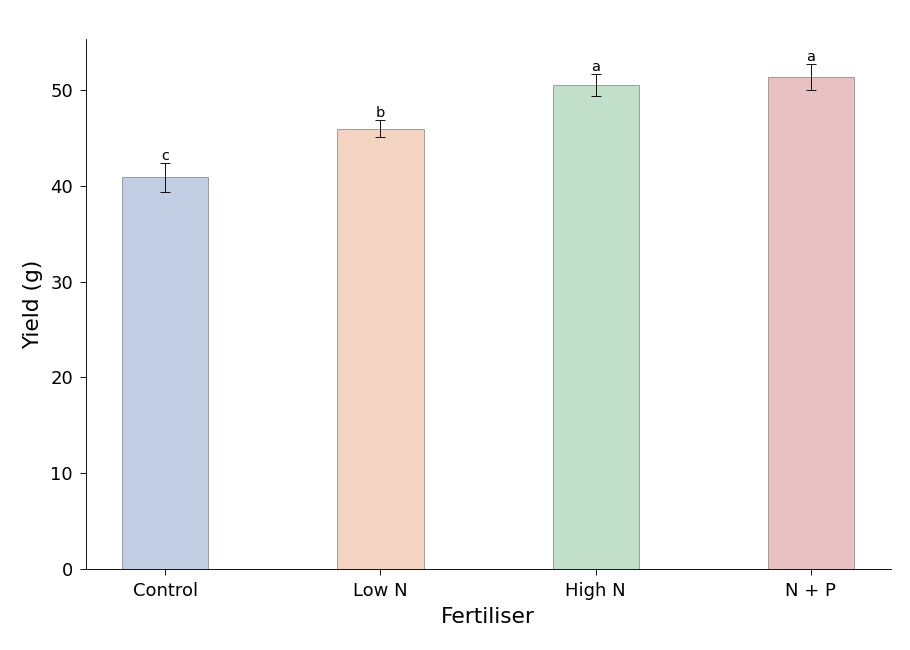
The finished figure: means, error bars, and the letters placed automatically — this is the panel a journal expects.
Styling and exporting this figure: see Figure styling and Exporting & downloading.
Report it like this
“Fertiliser regime affected yield (one-way ANOVA, F(3, 20) = 86.9, p < 0.001). Yields under High N and N + P exceeded Low N, which exceeded the control (Tukey HSD, p < 0.05); different letters in Fig. 1 indicate significant differences.”
- Tukey, J. W. (1949). Comparing individual means in the analysis of variance. Biometrics, 5(2), 99–114.
- Kramer, C. Y. (1956). Extension of multiple range tests to group means with unequal numbers of replications. Biometrics, 12, 307–310.
- Shapiro, S. S., & Wilk, M. B. (1965). An analysis of variance test for normality (complete samples). Biometrika, 52(3–4), 591–611. https://doi.org/10.1093/biomet/52.3-4.591
- Montgomery, D. C. (2017). Design and Analysis of Experiments (9th ed.). John Wiley & Sons.